Introduction
The first time I opened a stock chart, it looked like a mess of red and green bars that meant absolutely nothing to me. If you’re in that same spot, learning how to read stock charts doesn’t have to feel overwhelming. Once you understand a handful of basics, the chart actually starts telling you a story instead of looking like random noise.
What Is a Stock Chart Actually Showing?
Quick answer: A stock chart shows a stock’s price movement over time, typically displaying the opening price, closing price, highest price, and lowest price for each time period, usually through candlestick formations.
Think of it as a visual diary of every trade that happened during that period, compressed into a single shape.
Understanding Candlesticks — The Basics
Each candlestick represents one time period (a day, an hour, whatever timeframe you’re viewing). It has a body and thin lines called wicks or shadows.
- Green (or white) candle: closing price was higher than opening price
- Red (or black) candle: closing price was lower than opening price
- The wicks show the highest and lowest price touched during that period
Picture a stock opening at ₹100, dropping to ₹95, rallying to ₹108, then closing at ₹105. That candle would be green, with a body from ₹100 to ₹105, and wicks stretching down to ₹95 and up to ₹108.
Reading Trends: Uptrend, Downtrend, Sideways
Quick answer: An uptrend shows a series of higher highs and higher lows, a downtrend shows lower highs and lower lows, and a sideways trend shows price moving within a fairly consistent range without clear direction.
Spotting the trend is honestly more useful for beginners than trying to predict exact price targets. Trade with the trend, not against it — that’s advice I wish someone had drilled into me earlier.
Volume — The Most Underrated Indicator
Volume shows how many shares were traded during a period, usually displayed as bars below the price chart.
- High volume during a price rise suggests strong buying interest
- Low volume during a price rise can suggest the move isn’t well-supported
- Spikes in volume often precede or accompany major price movements
I’ve noticed a lot of beginners completely ignore volume and focus only on price. That’s a mistake — volume often confirms whether a price move is trustworthy.
Support and Resistance Levels
Support is a price level where a stock tends to stop falling and bounce back up. Resistance is where it tends to stop rising and pull back down.
These aren’t exact science — they’re zones based on historical price behavior where buyers or sellers have previously stepped in. [link to related guide on stock market mistakes beginners make here]
Moving Averages — Smoothing Out the Noise
A moving average calculates the average price over a set period (like 50 days or 200 days) and plots it as a smooth line on the chart.
- 50-day moving average: shows shorter-term trend
- 200-day moving average: shows longer-term trend
- When the shorter average crosses above the longer one, it’s often called a “golden cross” — generally seen as bullish
Common Chart-Reading Mistakes Beginners Make
- Trying to predict exact price movements instead of understanding general trends
- Ignoring the broader market context (a stock chart doesn’t exist in isolation)
- Overreacting to single-day price swings without looking at the bigger picture
- Not adjusting the timeframe — a 1-day chart tells a very different story than a 6-month chart
FAQ
Q1: What’s the easiest chart type for beginners to start with? Candlestick charts are generally recommended since they pack the most useful information (open, close, high, low) into one visual.
Q2: Do I need to learn technical analysis to invest in stocks? Not necessarily — long-term investors can succeed with fundamental analysis alone, but chart reading helps with entry and exit timing.
Q3: What does a long wick on a candlestick mean? It usually indicates strong price rejection at that level — buyers or sellers pushed price back after testing an extreme.
Q4: How far back should I look on a stock chart before investing? Looking at 6 months to 1 year gives a reasonable sense of recent trend, though long-term investors often check 5-year charts too.
Q5: Can stock charts predict the future accurately? No chart guarantees future performance — they show patterns and probabilities, not certainties, so always combine chart reading with broader research.
Conclusion
Learning how to read stock charts is really about pattern recognition built over time, not memorizing rules. Start by identifying trends and volume on a stock you already know well, and build from there. Open a chart of any stock you’re curious about right now and try spotting the trend before reading any analysis on it — that practice builds real intuition faster than any tutorial.
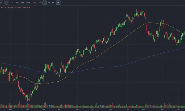
Suggested image alt text: “candlestick stock chart showing uptrend and volume indicators”